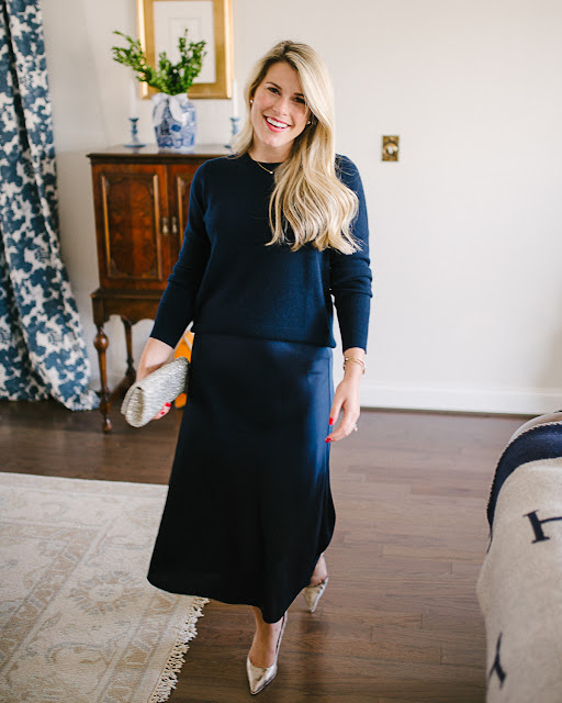
I get asked this each year around this time, 'what should I wear for our holiday card photos'? I think this is a fun topic and I love to brainstorm outfit ideas for this occasion!
I am really on top of my game this year because we are using a wedding photo so we don't have to actually take a specific photo. This has made things SO much easier. I already have my cards ordered and I'm just waiting for them, ha!! I have been dreaming of the year we can finally write 'The Snyders' and I'm so glad we can this year!
So while I don't have to plan for an outfit this year, I do think the one I am sharing today is exactly what I would have worn. I think it's kind of fun to put a little more thought into an outfit than you typically would. Not only for aesthetics but I think it's fun to put reasoning behind why you chose something.
For example:
2019// This was the first year we were sending out cards together. We had been engaged for almost a year and had been living in our new home for about 6 months. I wanted this to feel festive and very coordinated and cohesive. We dressed up because I felt like there was so much to be celebrating!
2020// This was the worst year- all along I thought this would be our wedding year Christmas card and it wasn't so I just felt like simple and casual was the way to go as it represented what 2020 had been.
Some Tips:
Before these years, I did my own Christmas cards for business purposes. Doing a photo with just one person in it is SO MUCH easier. But when you add in more people not only do you have to make sure their eyes are open in the shots and that everyone is smiling/looking at the camera, but you also want what you're wearing to look cohesive.
Taking photos with my husband and Henry is challenging because Henry is 26 pounds and probably only about 18" off the ground. He's a little guy. My husband is 6'2". The size difference is a LOT. In 2019, we ended up crouching to meet him closer to the ground. And in 2020, my husband picked him up. Otherwise, he kind of gets lost/looks really small in the photos we take of the three of us. See how in the photos above Henry gets kind of lost at our feet? Basically, this is your reminder to play with sitting and standing so that you get everyone in!
I don't personally like anything too matchy-matchy- if you have children, sure, but otherwise, I always think perfectly matched typically looks too contrived. I'm talking like 1990s matchy-matchy. We took family photos where everyone on my dad's side of the family was in a white shirt and khakis. I'll have to find the photo but it was like 10+ people and that's a whole lot of white shirts and khakis, haha!! I think that makes the photo also look dated as that was popular during that decade which is another reason not to go too trendy in your wardrobe decisions or too trendy in what is popular at the time. Ohhh the '90s.
Also, you can see in the 2020 photo above (that we didn't use) that even though our cream sweaters were very different in person, they showed up in the photo looking too similar so that's another reason why we chose not to use this shot. Which, leads me to another tip... bring some different clothing options! We didn't realize how matchy we looked until I saw the photo on the camera and I was like ok we need to switch this up!!! All we had to do was have my husband remove the sweater and he had a vest on hand and the plaid shirt was already underneath the sweater. Such an easy fix. This is definitely more of my personal opinion, though, so if you all want to precisely match, you do you! After all, it is YOUR holiday card! Hey... I love to do matching pajamas on Christmas morning, so I'm not knocking it, it's just not a vibe I prefer for a holiday card photo!
If you work within the same color palette, you'll get that cohesive feeling without literally matching!
I also think it's important to also have everyone dressed for the same weather. For example, if you have some people in winter coats and then someone else in a sundress, it will look a little off even if they are all in the same color scheme. I also think the same goes for the level of dressiness. If you're in a gown and your husband is in jeans, it just won't look as cohesive!
If you have a super busy or colorful background, keep your outfits on the simpler side. If you have a less busy background, like a beach, then I think you can do more in terms of color and pattern. I personally think mostly solids look best with a pop of color or pattern here and there, but that is more of a personal preference than a tip.
This is not always possible, but if you can, pick out the card template before taking the photos. Then you will know if you need a good vertical or landscape shot, you can incorporate a specific color or style, or location. You will also know if you need to shoot a photo leaving space for text to sit or if you won't need to do that! I have done this for the past two years and this year is the perfect example of us not being able to choose the card ahead of time before we took the photo. However, because it was our wedding, we had SO many photos to choose from that I was never worried we wouldn't be able to find a shot. I think nowadays most companies make these templates really easy for users to just drop in their photo without any tinkering, so this is really a minor suggestion
Make sure your photo is higher resolution than it would be for internet usage. If you hire a professional photographer, you can disregard all of this but I do know that there are quite a few people who DIY (like me!!). A smaller file is preferable for photos on the internet. For example, all of the photos I take and share here on my website are photos that I compress in size. I shoot 'raw' on my camera and these are HUGE files. I'd never upload raw photos here to my website. The large size would really slow down my site! Think about when you upload a video vs. a photo. It takes longer for the video simply because that file is larger! Most social media sites, like Instagram, will also compress your photo size if necessary. Apps like VSCO will also shrink them down if necessary. It's still at a size that you can print from, but not the best size for print. The higher the resolution, the better for things in print! Do you ever notice that you print photos from your phone and they look grainy and then you print photos from your camera and they look so much clearer? It's not only because of the higher quality lens, but it's also because the file was not compressed by an app like VSCO or Instagram! So, if you only shoot photos with your phone, make sure that if you are planning on printing, edit in an app that will not adjust your file size so that when you go to print, you have the full resolution! I would recommend using the Lightroom mobile app or sending the raw photo to your computer using airdrop and then edit using Lightroom for desktop!
I'll share some more outfits in the coming weeks as well so stay tuned!


0 Yorumlar